The Lab Bench.
A self-initiated, student-led Warwick Chemistry podcast that I pitched, branded and produced, from the hand-drawn logo to the episode artwork, thumbnails and filming.
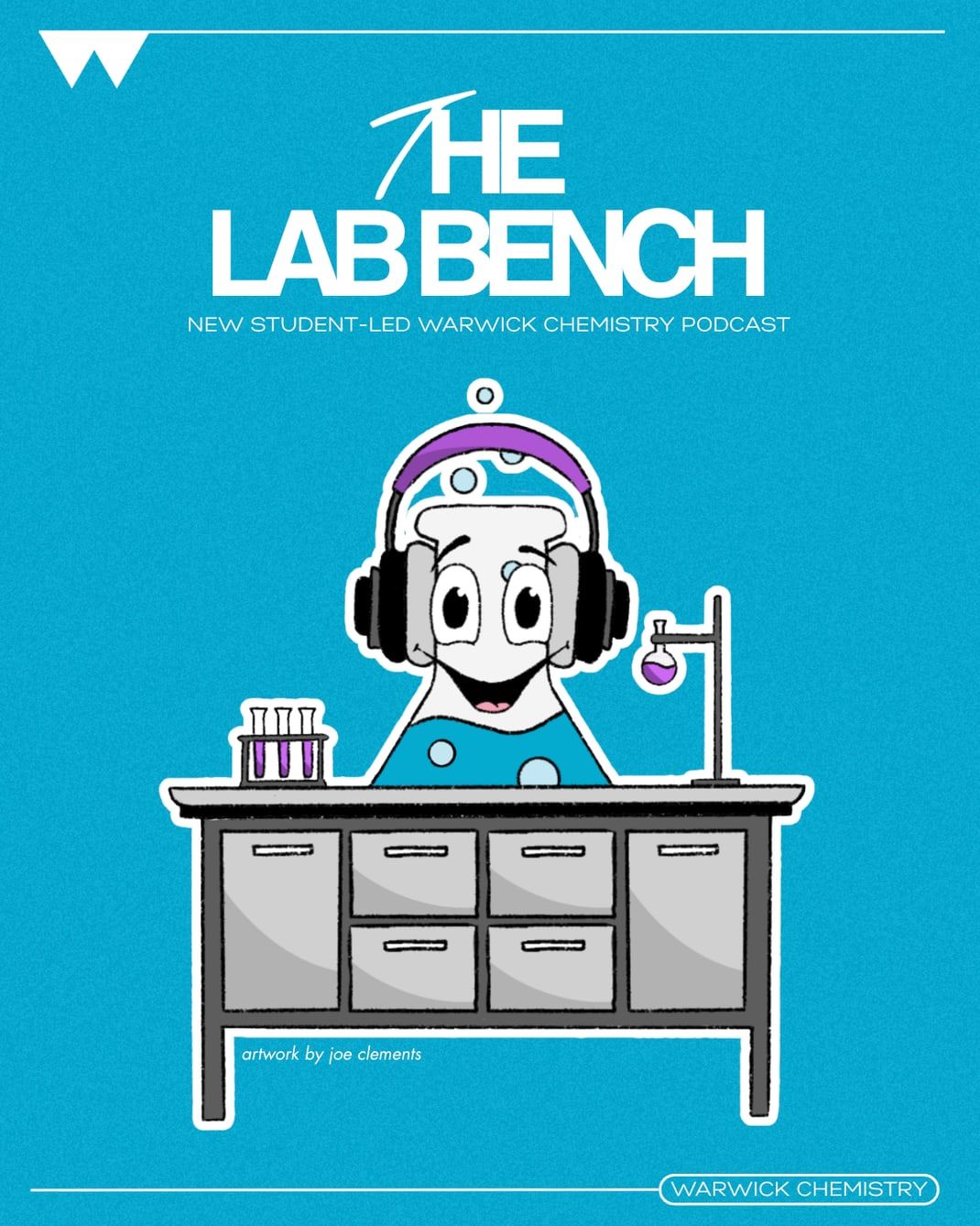
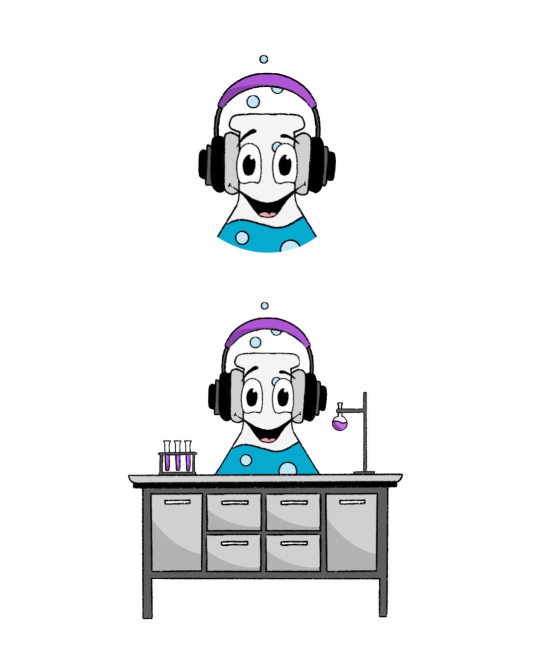
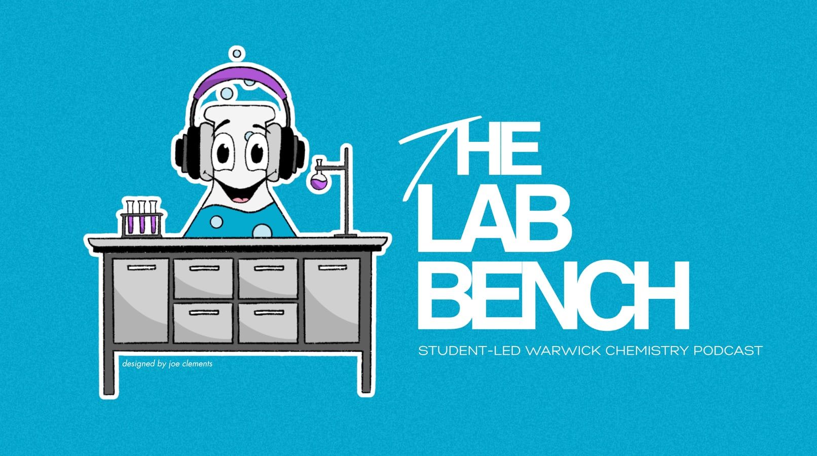
I pitched, designed and created The Lab Bench as part of my time with We Are Chemistry, the student-led podcast for Warwick Chemistry. It was fully self-initiated, so I had complete creative ownership from the first pitch through to producing and promoting each episode. I drew the logo by hand and designed the brand identity and the social media assets for every episode.
It brought design, filming, writing and marketing together in one project, made for prospective students and the wider chemistry community. The podcast has had over 1,000 viewers and has been a great asset for outreach to prospective students at Warwick.
A playful brand
I didn't want it to feel too formal or overly academic. Chemistry can come across as quite serious, so I deliberately went in a more playful direction to make it feel approachable, especially for prospective students.
Drawing the logo by hand was a big part of that. The beaker character with headphones gives it personality straight away and makes it clear this isn't another lecture-style podcast. It feels more like a conversation. Doing it by hand also meant it felt original and a little less polished in a good way, which helps it stand out and feel student-led.
I chose teal as the main background because it still feels scientific but more modern and relaxed than the usual blues, with purple as an accent to add contrast and make key elements pop. Keeping the palette simple made it easy to carry across every post and thumbnail, so everything looked consistent.
This part of the project taught me how important it is to match the design to the audience. Every choice was about making chemistry feel more accessible and less intimidating.
Episode posters
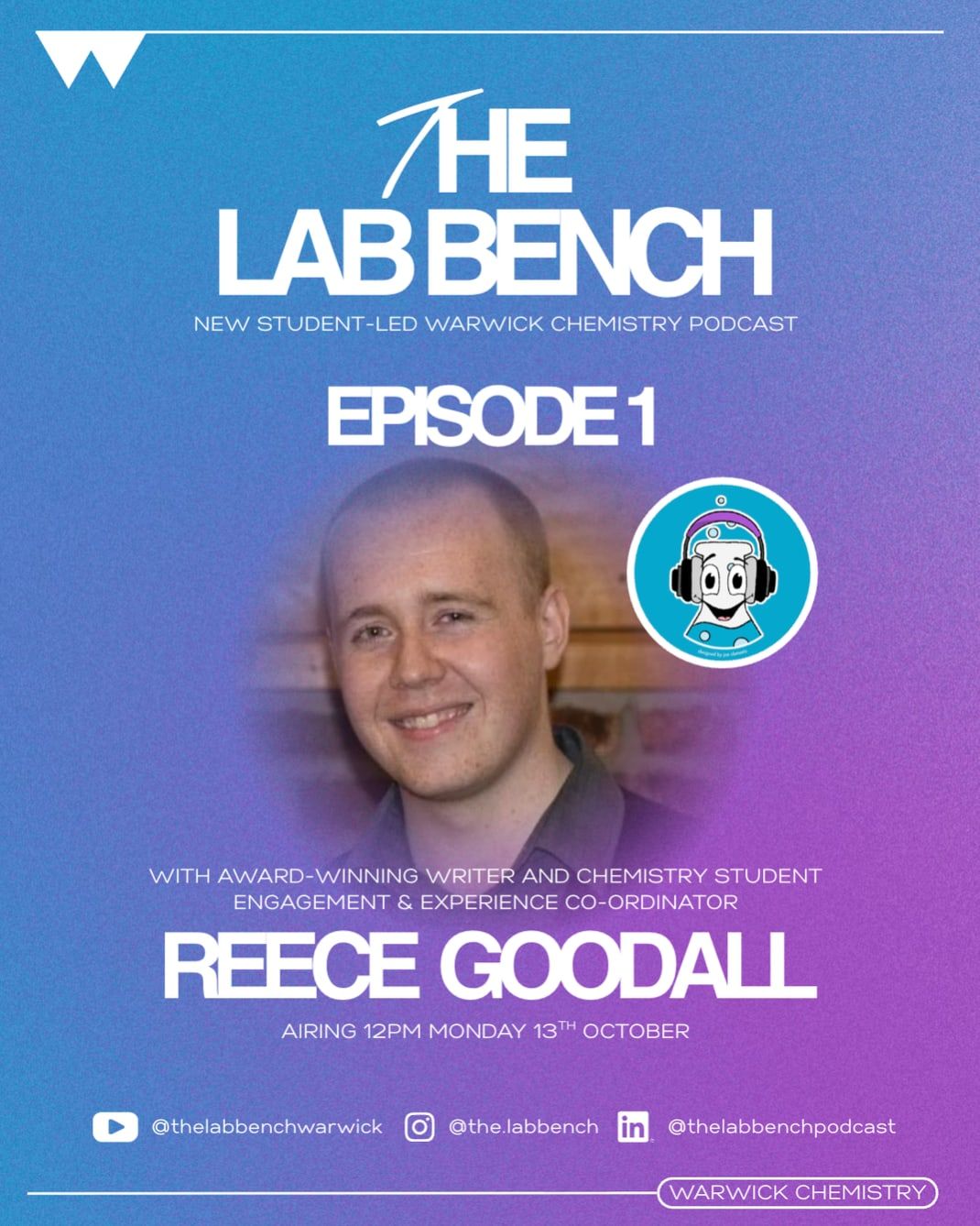
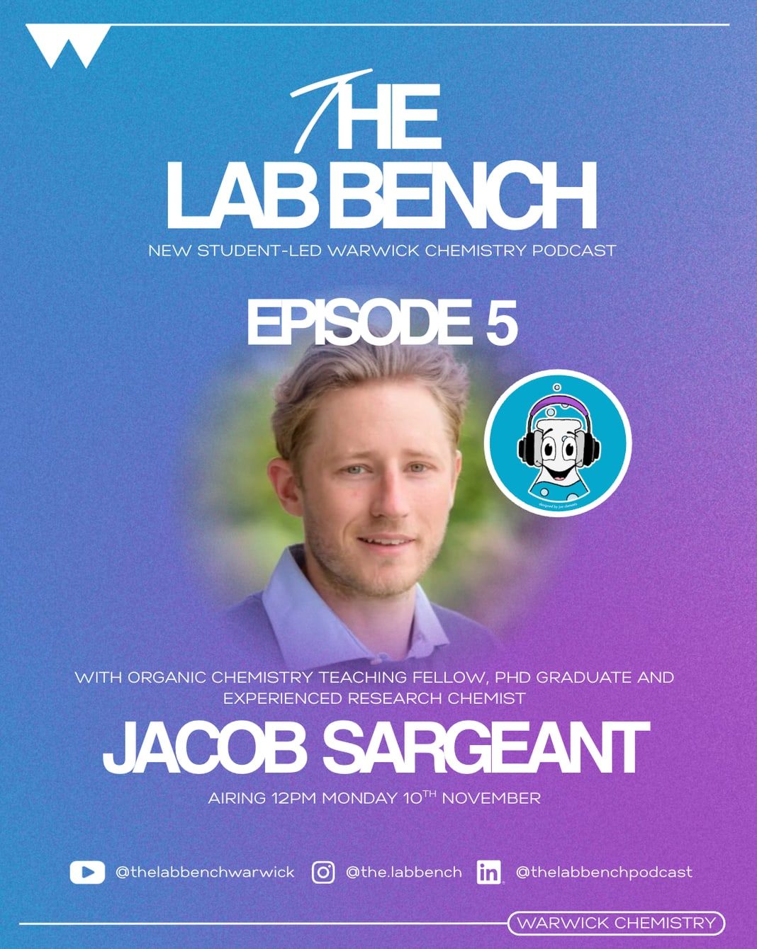
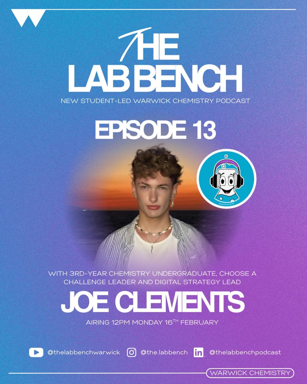
I wanted a design I could reuse every time that would still feel fresh for each guest. The layout stays the same across all episodes, which builds recognition, while the portrait and subtle colour shifts in the background give each one its own identity. A soft gradient blur blends the portrait into the background and keeps the focus on the name and episode number.
Typography does most of the work: big, bold names for the guest and smaller supporting text for context, without overcrowding the design. The logo sits in the same place each time as an anchor back to the brand. It also made the process scalable. Once the system was set up, I could produce new episode graphics quickly and keep everything on brand.
YouTube thumbnails
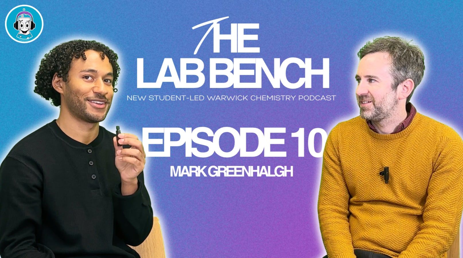
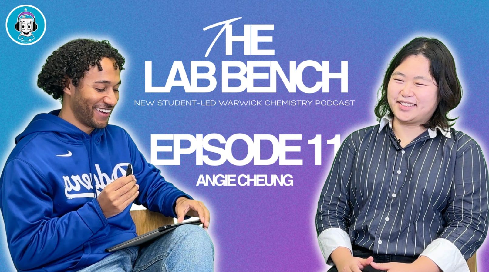
The goal was simple: make them instantly readable and clickable. I kept the brand gradient but pushed the contrast so they stand out at small sizes. The host and guest are cut out cleanly and face each other where possible, which feels conversational and hints at the format.
Text is minimal and bold, just the episode number and guest name, because anything extra gets lost at thumbnail size. The consistent layout means that even while scrolling, you can tell it's The Lab Bench straight away.
In-episode graphics
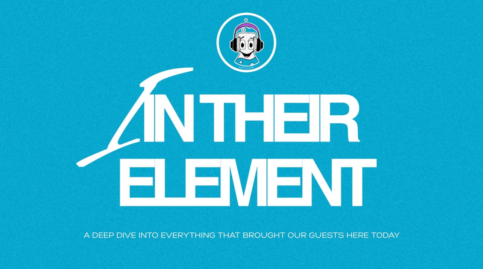
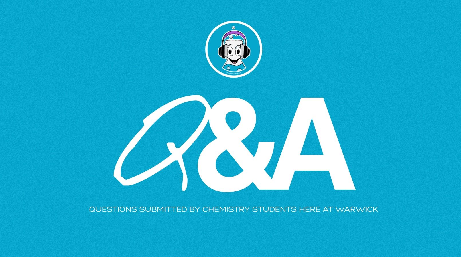
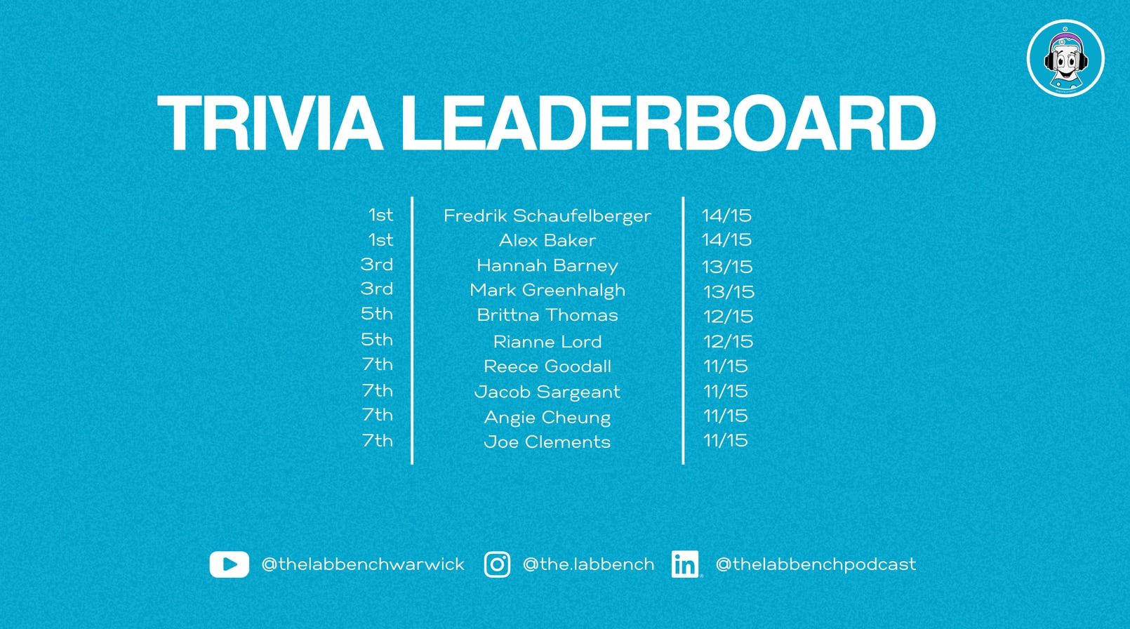
The segment graphics are clean and consistent so they feel like natural pauses rather than interruptions. They share the same background, typography and logo placement, which ties each episode together visually.
A note on later episodes
I worked on The Lab Bench until August 2026 and haven't been involved since. Any episodes, artwork or graphics published after that, including AI-generated graphics, aren't my work.