Centre for Belonging brand and website.
A complete brand identity and website for the Centre for Belonging in Education: four custom colours, three logo variations, hand-drawn characters, typography and mockups, plus centreforbelonging.org.uk.
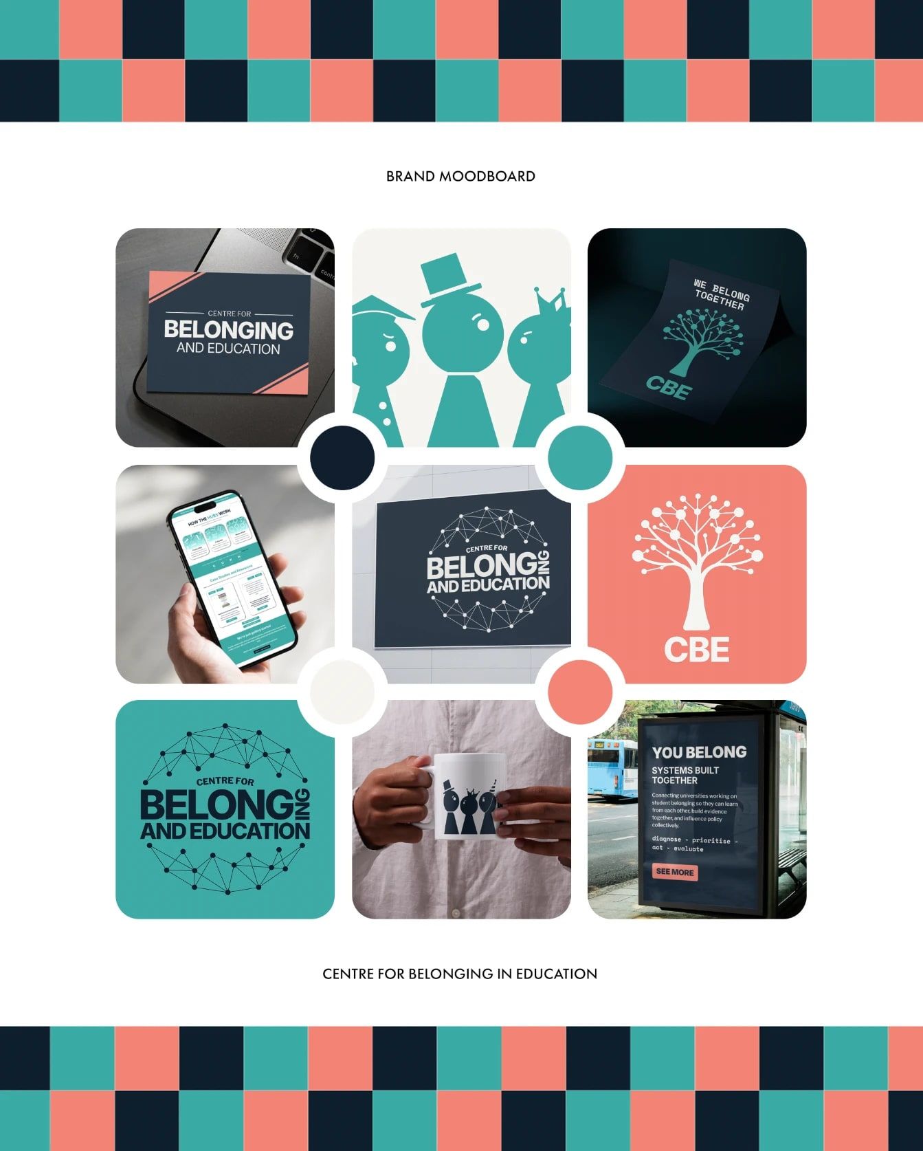
As one of the leads at the Centre for Belonging in Education, I have led the whole of its design process. I designed and developed a complete brand package and a full website, and pitched and created several student-focused projects to inspire future collaboration between students and staff.
The logo suite
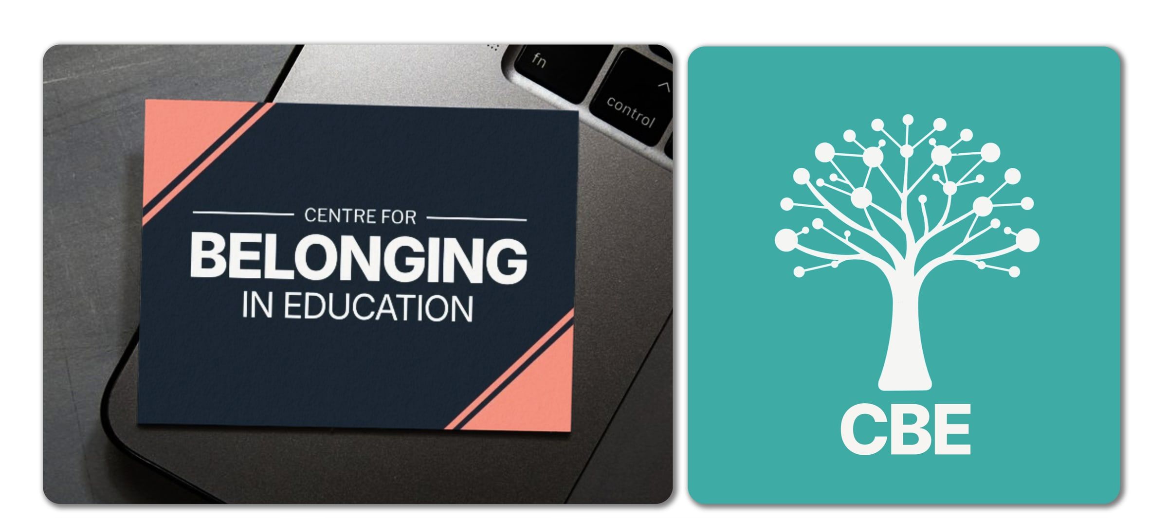
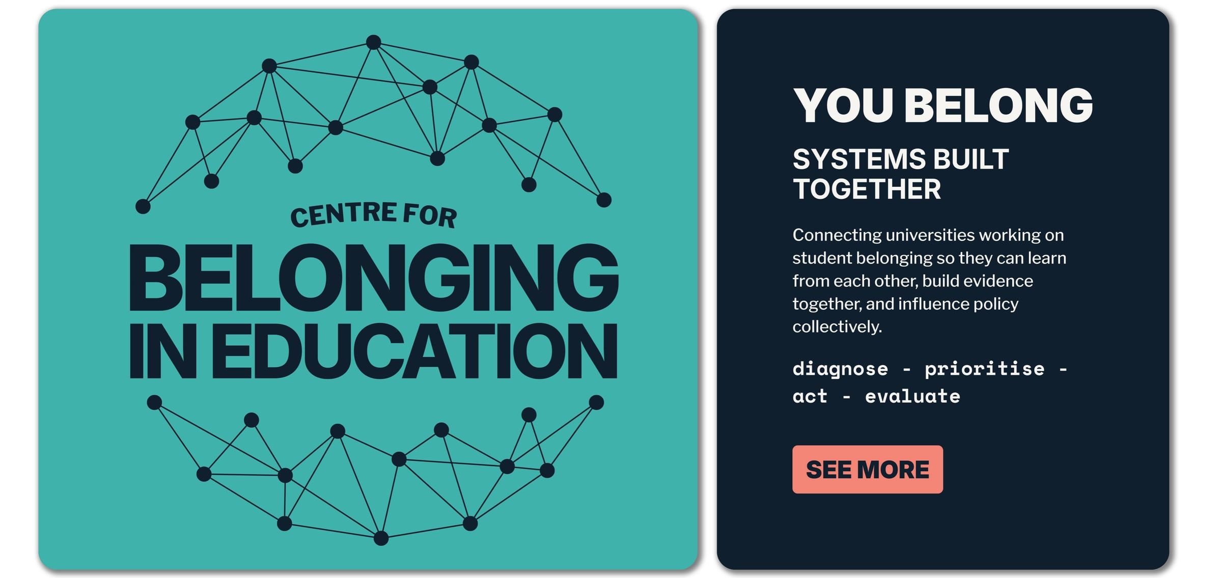
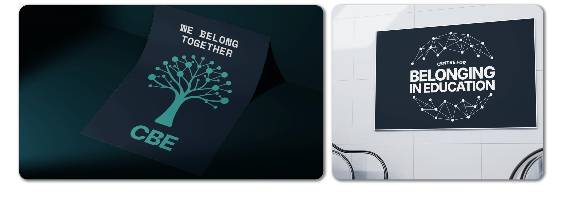
The logo suite was developed to represent connection, growth and collaboration, which sit at the core of the Centre for Belonging in Education. Each variation combines structured typography with more organic, hand-drawn elements, balancing professionalism with a human, approachable feel.
The hand-drawn tree and neural network motifs symbolise both personal growth and connected communities, reflecting the relationship between students, staff and institutions. Together, the three variations give flexibility across different uses while keeping a cohesive and meaningful identity.
Colour, type and characters
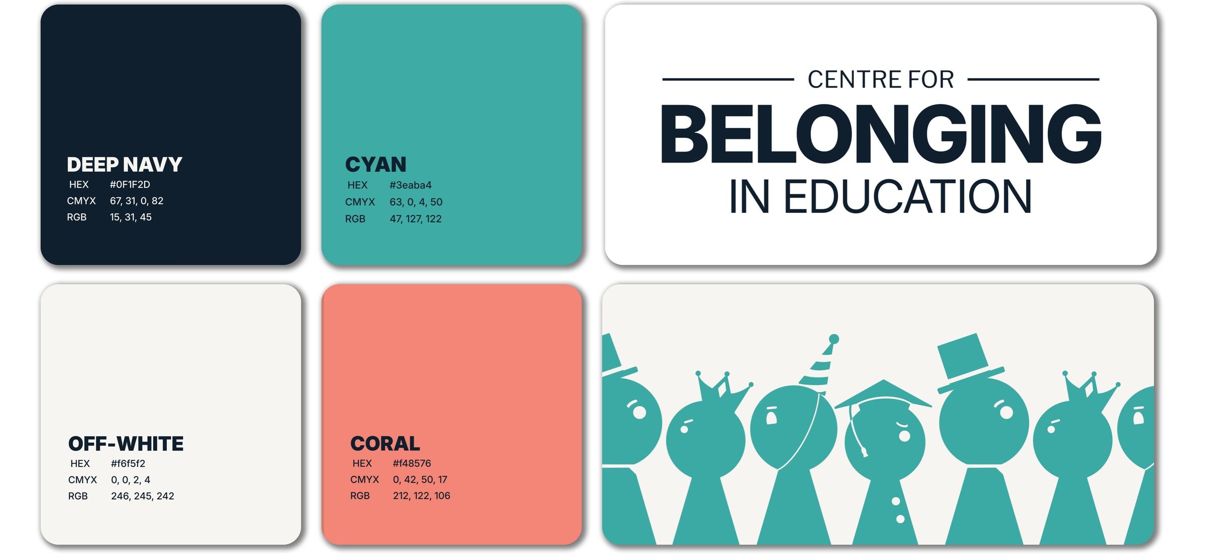
The brand moodboard set a clear visual direction, bringing together colour, typography and custom design assets. The palette balances deep navy and teal with a warmer coral accent, so it feels professional yet approachable, reflecting both academic credibility and human connection.
I chose clean, modern typography for clarity across digital and print, with a strong, authoritative presence. Alongside it, I introduced custom hand-drawn assets, including the central illustrated figures, to give the brand a more human and relatable side.
Combining structured design elements with more organic visuals positions the Centre as both credible and people-focused. This stage kept every output consistent and reinforced the core themes of collaboration, belonging and shared experience.

The website
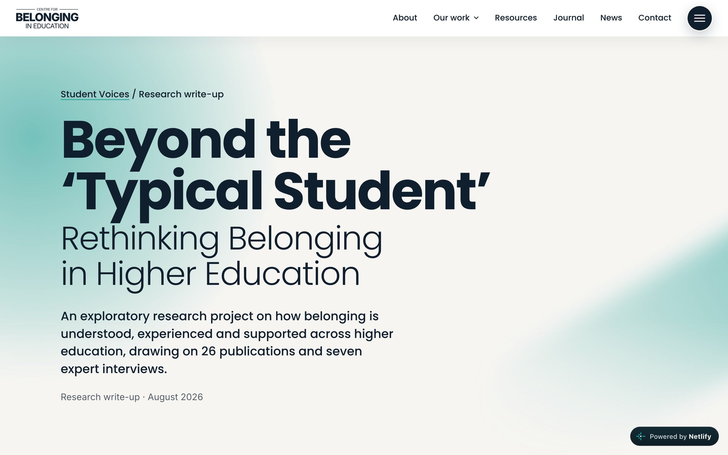
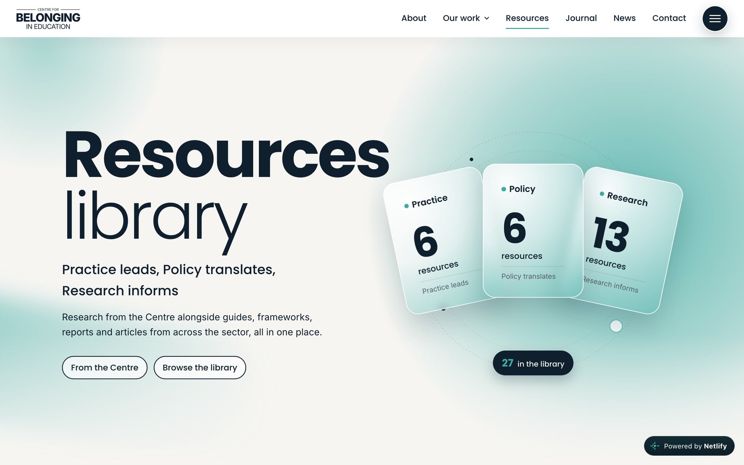
The website translates the brand into a clear, accessible digital experience. A clean layout and consistent colour and typography make the site feel professional and easy to navigate, while keeping a warm, approachable tone.
Sections guide visitors through the Centre's purpose, from introducing the team and network to its key initiatives and resources. Soft gradients, icons and custom assets reinforce the themes of connection and collaboration throughout.
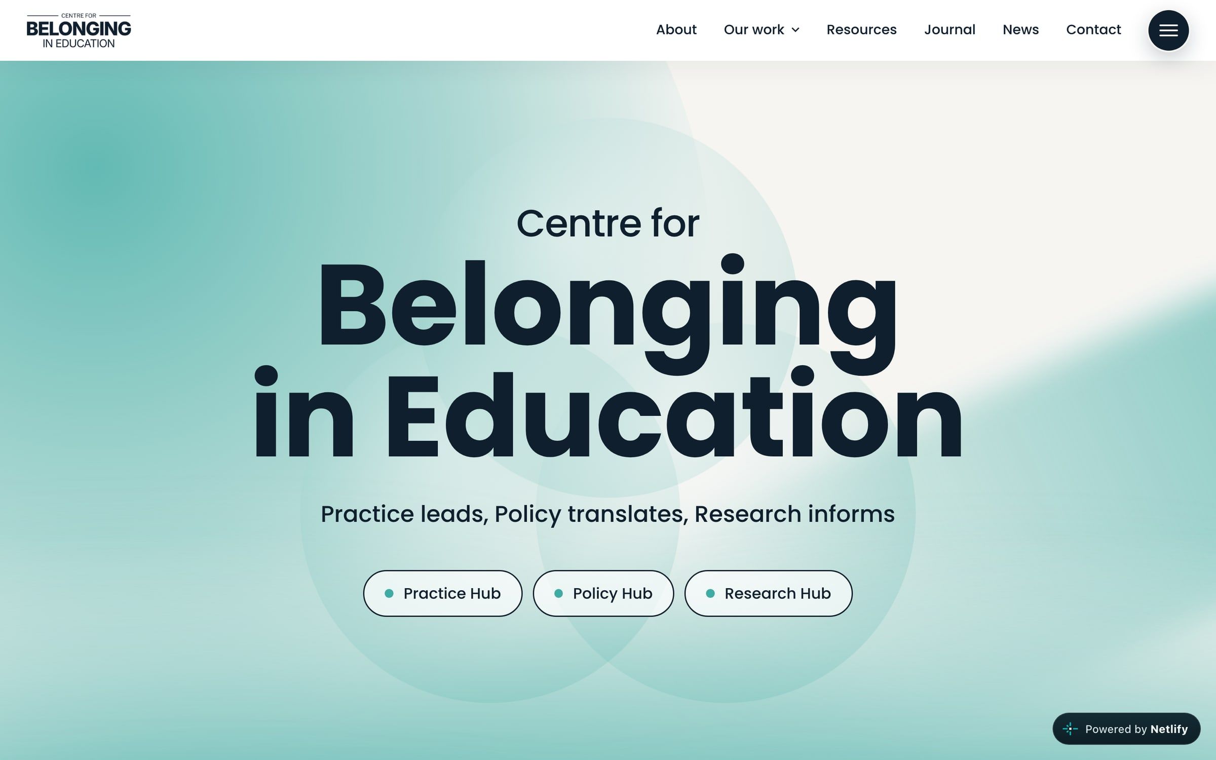
I put particular focus on readability and user experience, so information is clear on both desktop and mobile. That lets the site serve a wide audience, from students to academics and sector professionals.
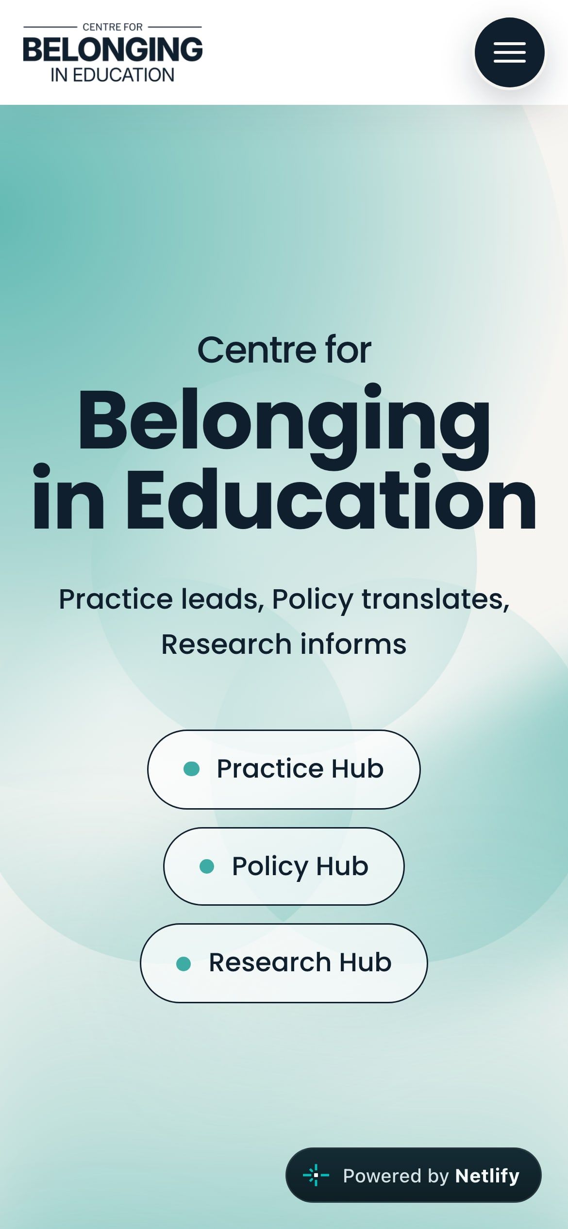
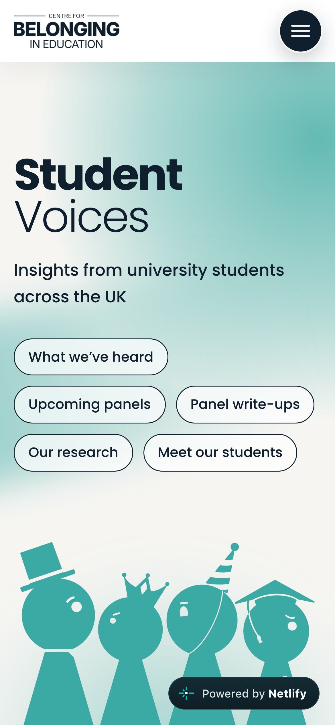
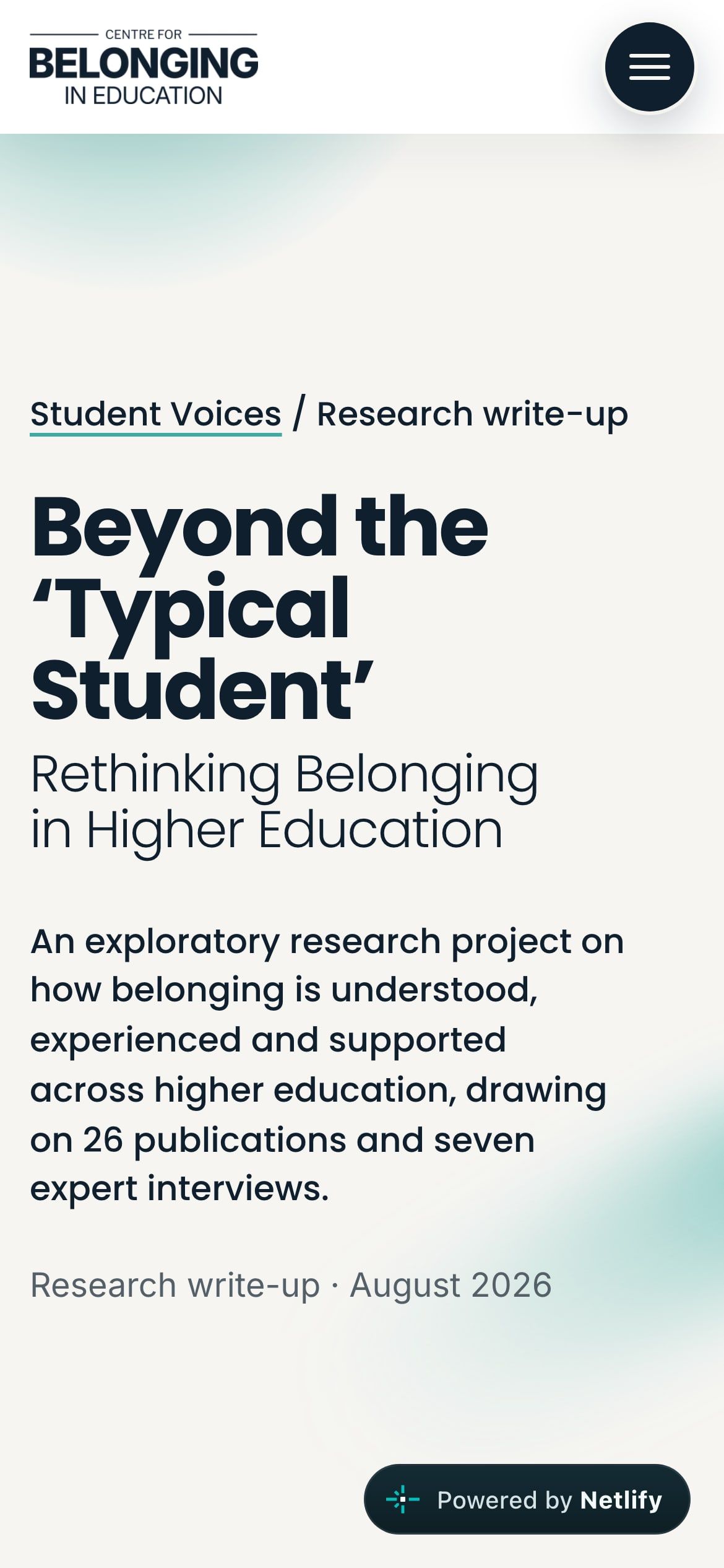
Buttons and content cards are designed to encourage people to get involved, whether that's exploring resources, joining events or connecting with the network. It makes the website an active platform for collaboration and participation, not just an information hub.
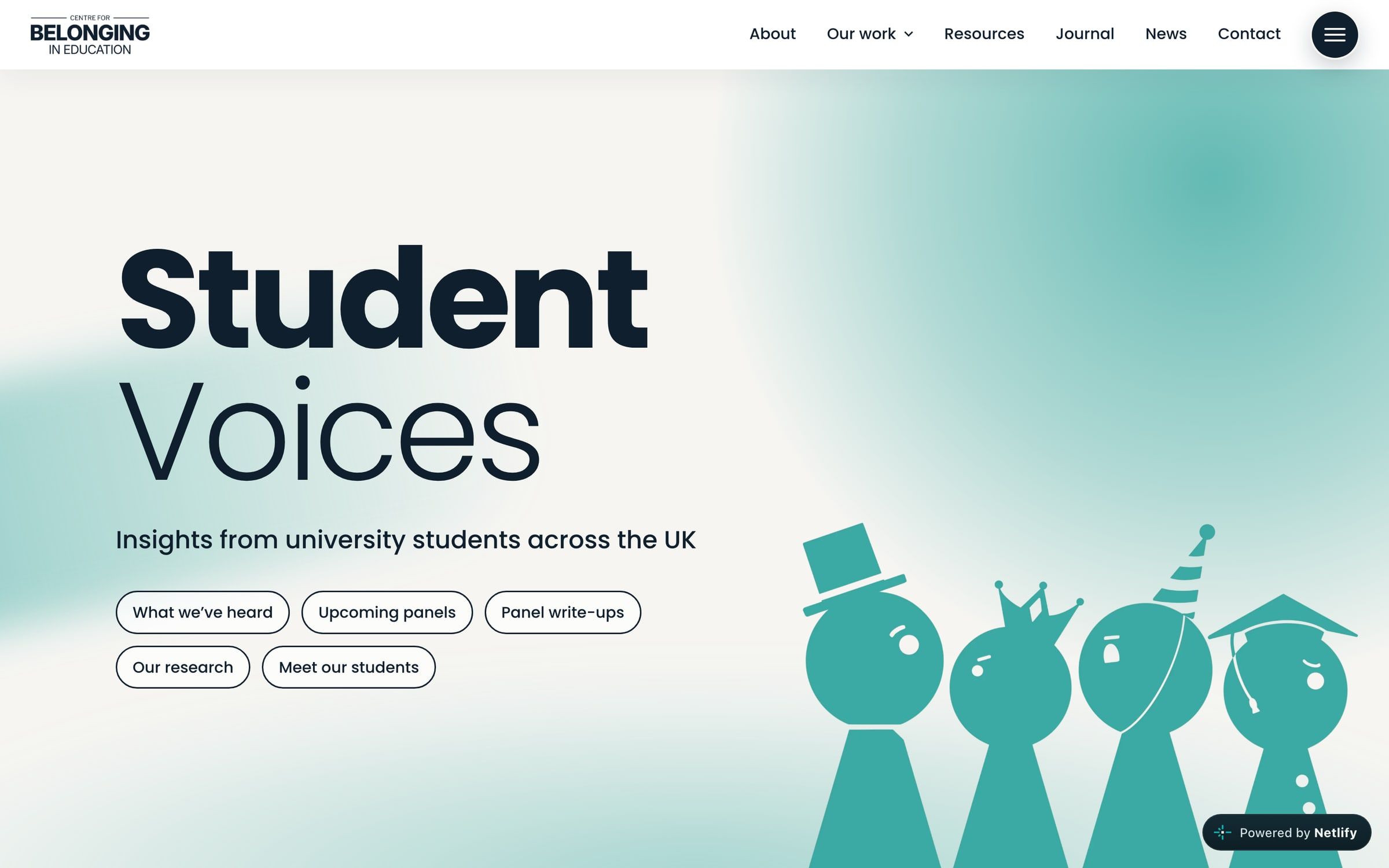
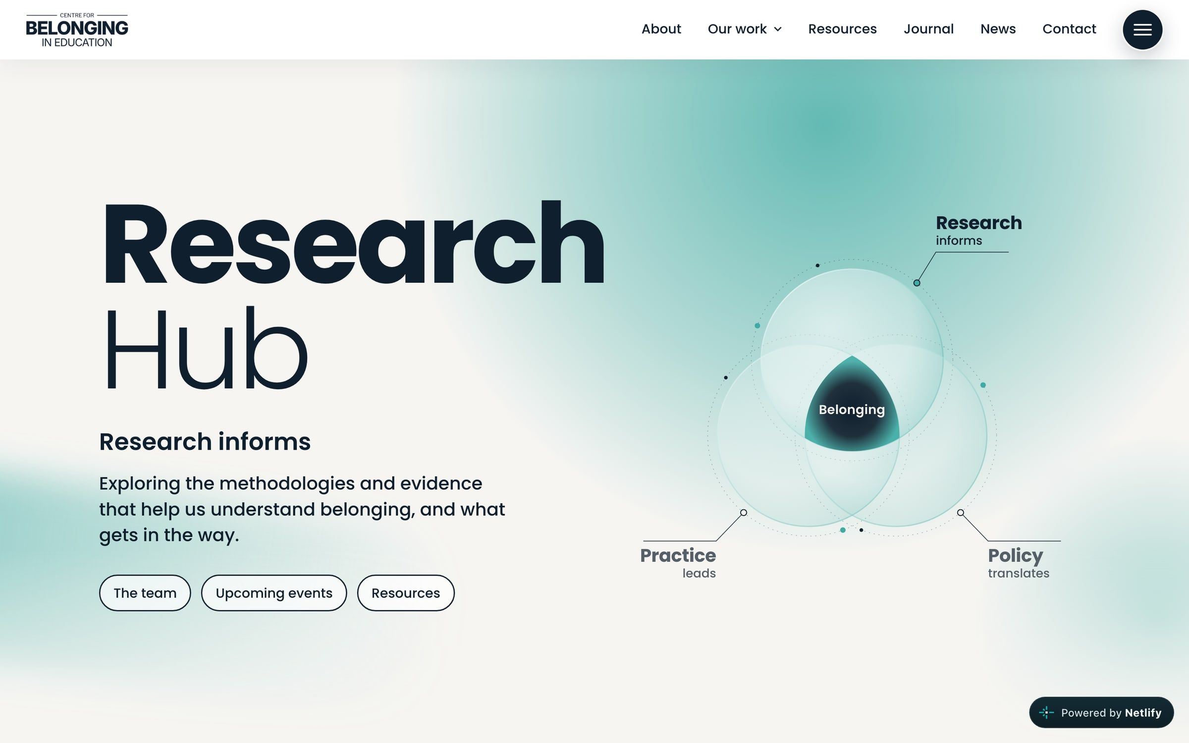
The design is built to scale, with flexible layouts and reusable components that can adapt as the Centre grows. The site can keep evolving with new initiatives, partnerships and content while keeping a consistent, recognisable identity.
Still growing
Alongside designing the brand and website, I'm still involved in the Centre as Senior Student Lead, supporting its ongoing development and communications. It means I can take a long-term approach, evolving the brand and platform as the Centre grows, and I'm excited to keep building on it, with new initiatives and creative projects already in development.
In their words.
I've seen firsthand Joe's skill, drive and commitment to making our comms distinct and eye-catching. Joe drives creative change, implementing ideas from a new colour palette to a popular podcast series, and I'm always confident that a task left with him will be completed effectively.
Dr Reece Goodall
Co-Lead, Centre for Belonging in Education
Student Engagement Coordinator, University of Warwick