Karting Graduates.
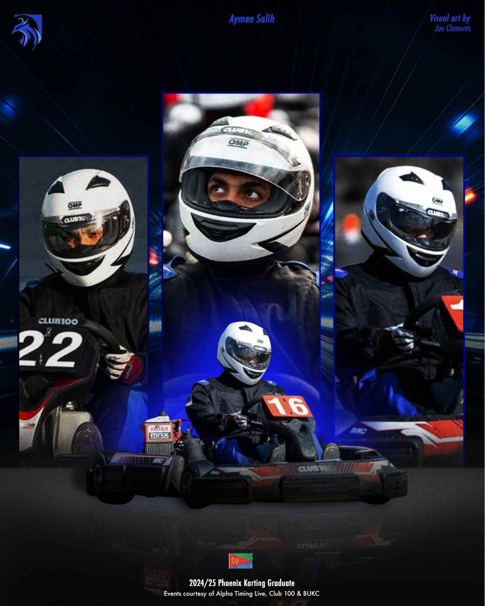
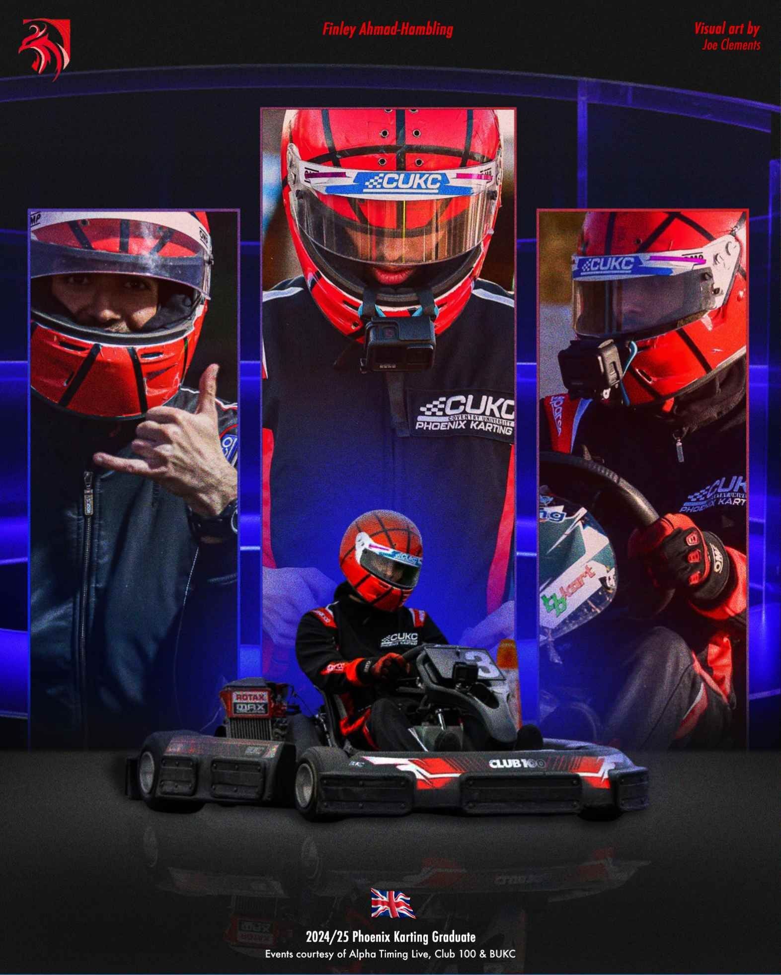
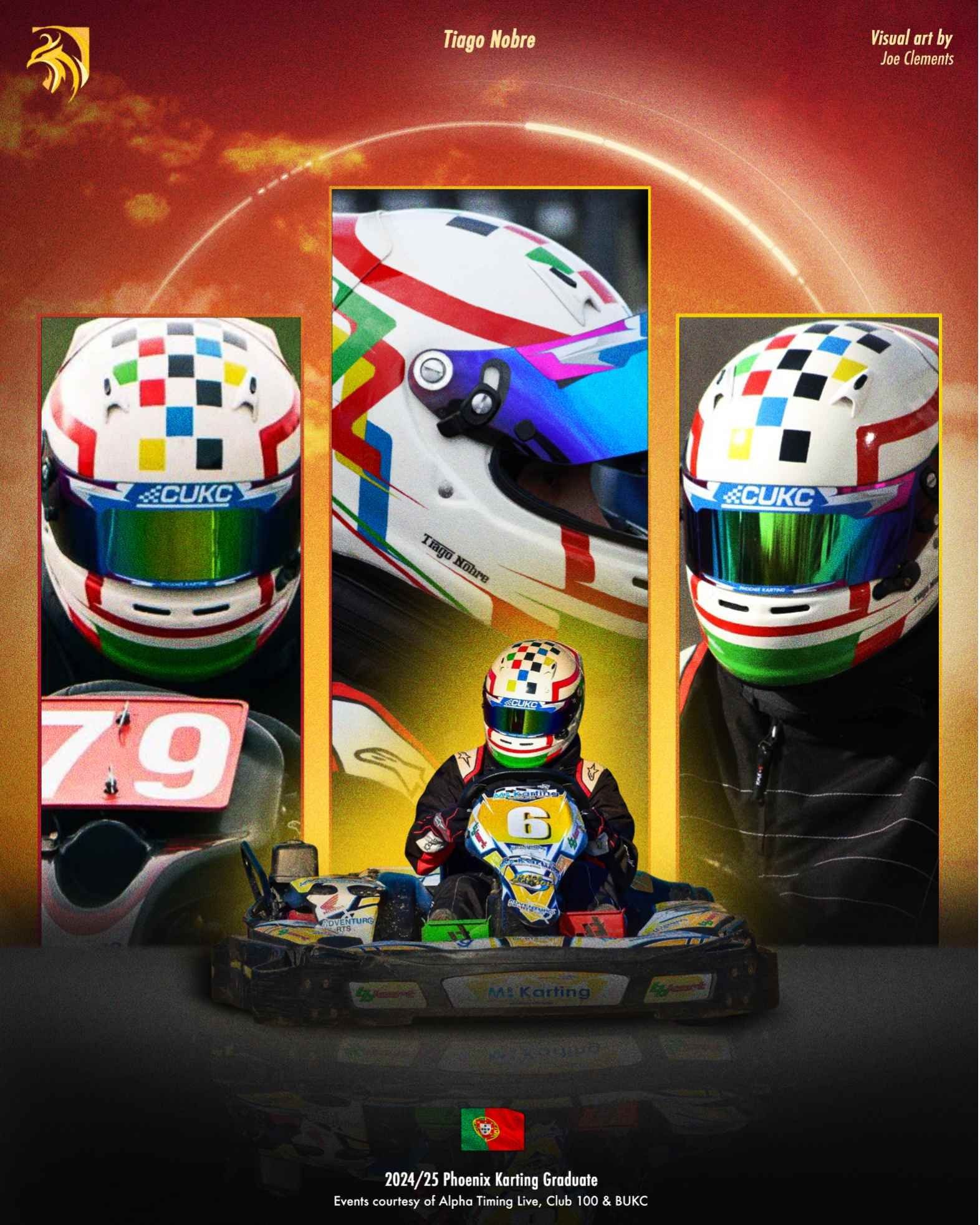
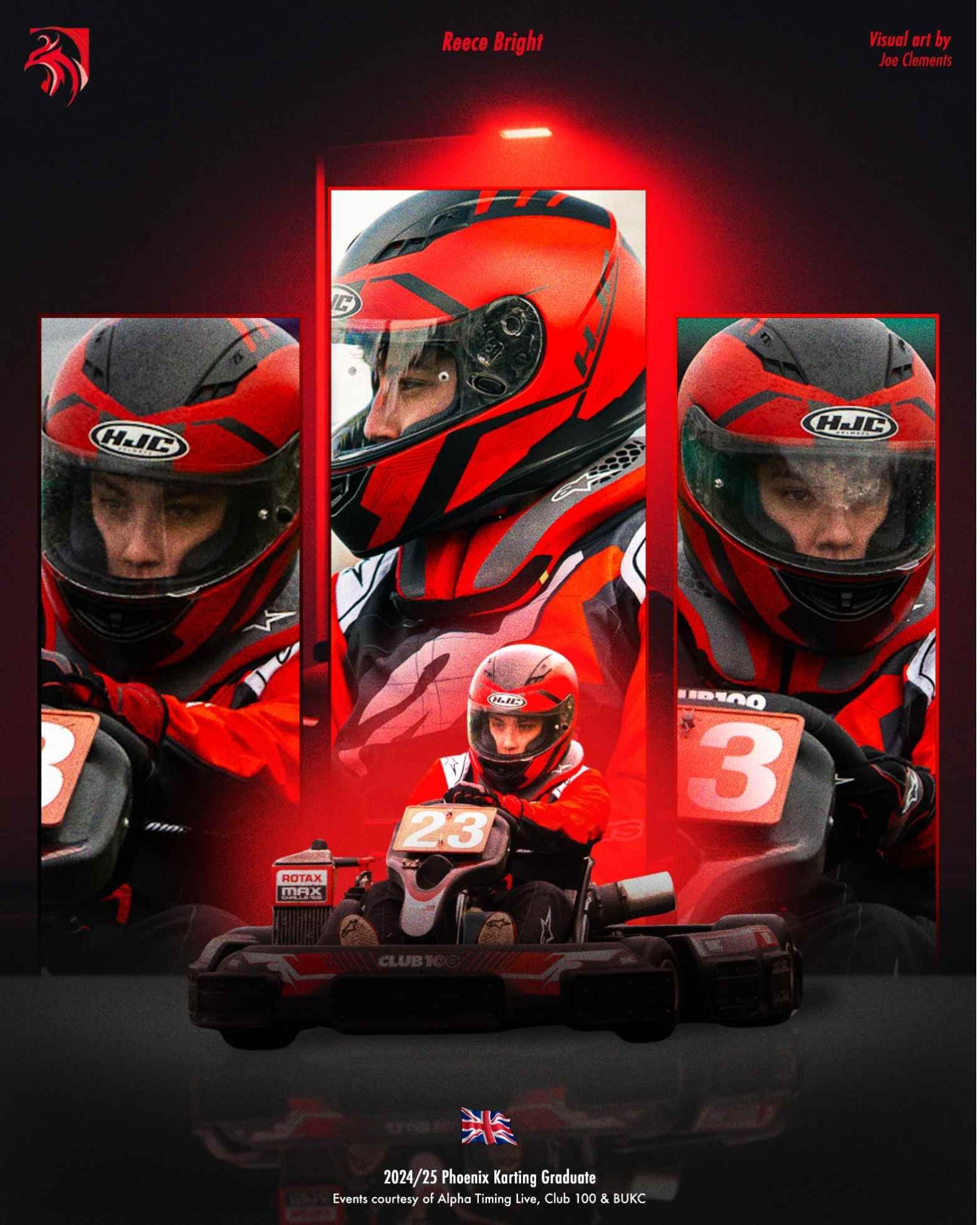
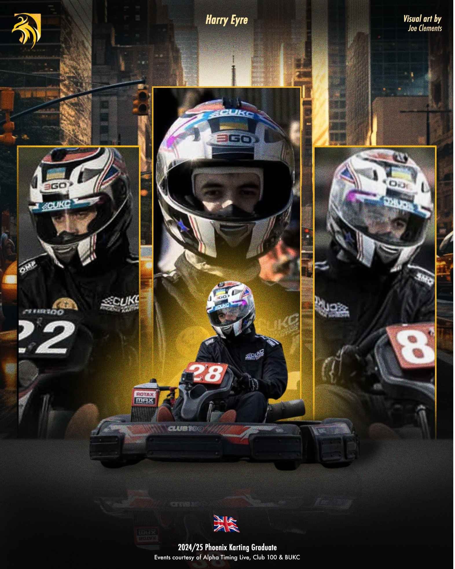
A series of sports posters for Phoenix Karting at Coventry University, celebrating the 2024/25 karting graduates and their time on Coventry's karting teams.
These sports posters were part of a social media project for Phoenix Karting at Coventry University. The aim was to celebrate the 2025 karting graduates with tributes to their time on Coventry’s karting teams. I designed and created more than ten posters using Photoshop and Illustrator.
One series, every driver
This began as a personal passion project, with the aim of creating a set of posters to celebrate the graduating drivers at Phoenix Karting. A key focus was making each design reflect the individual driver through their suit colours while keeping a cohesive visual style across the whole set.
Balancing personalisation with consistency let each poster feel unique while still working together as one series.
Building a poster
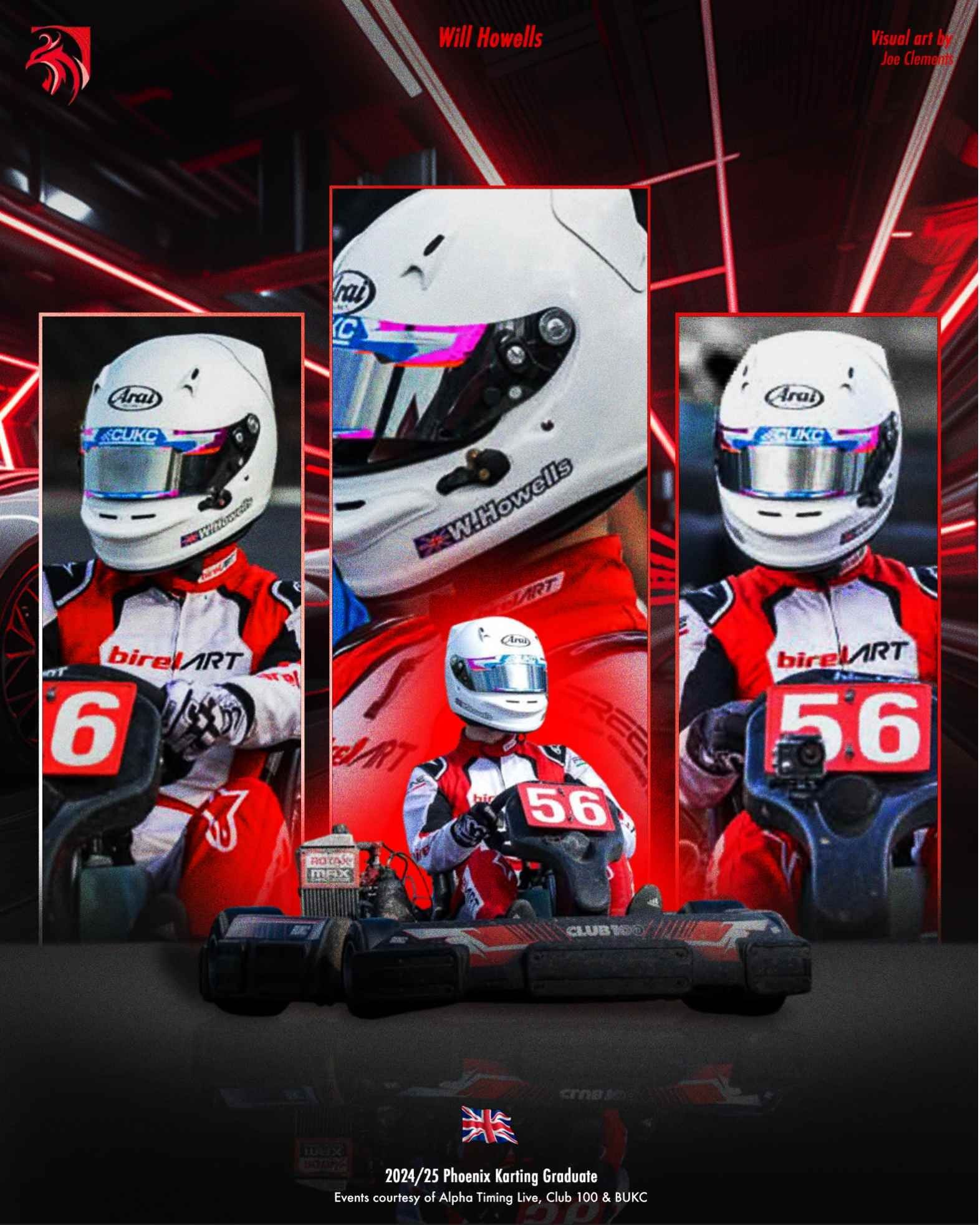
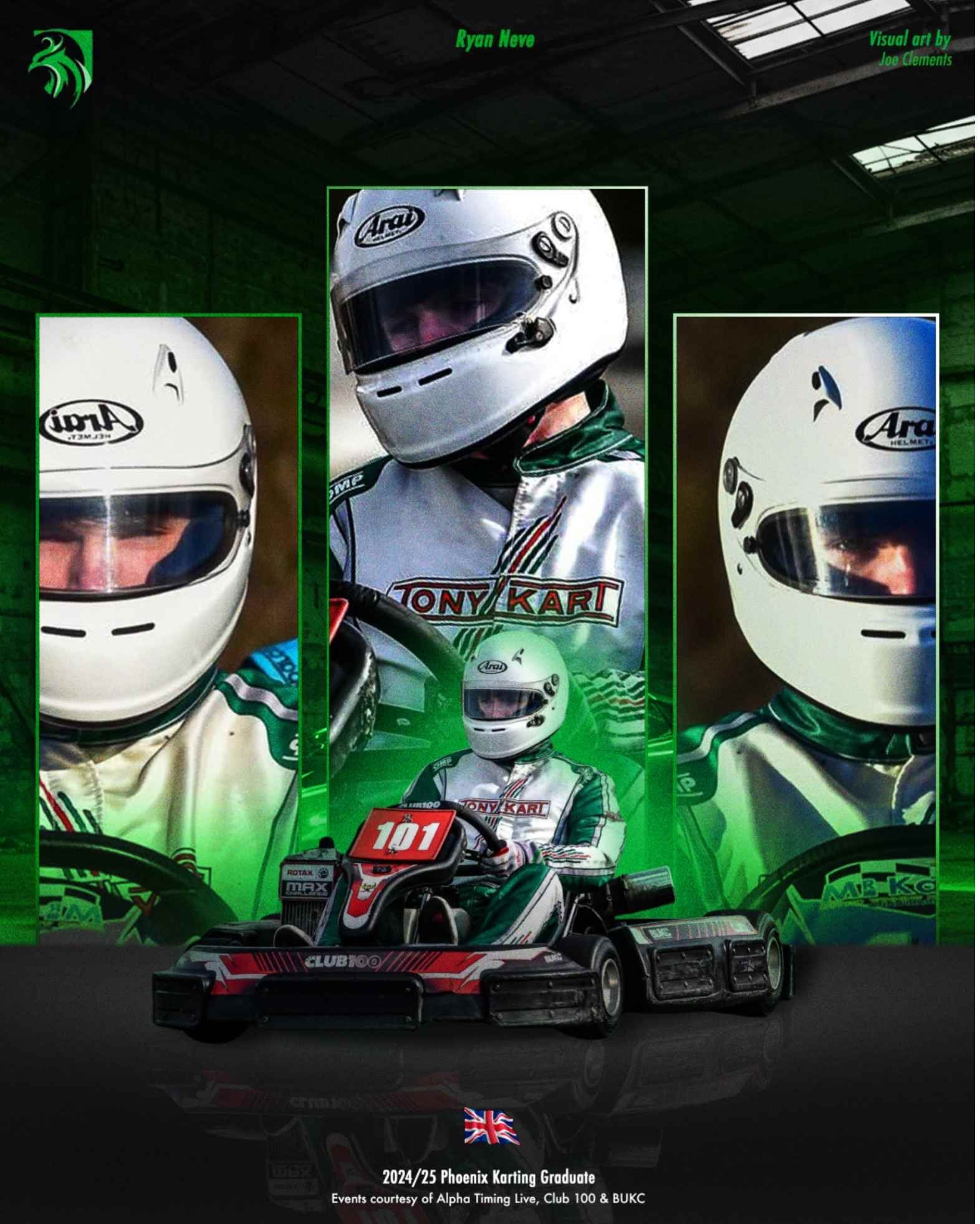
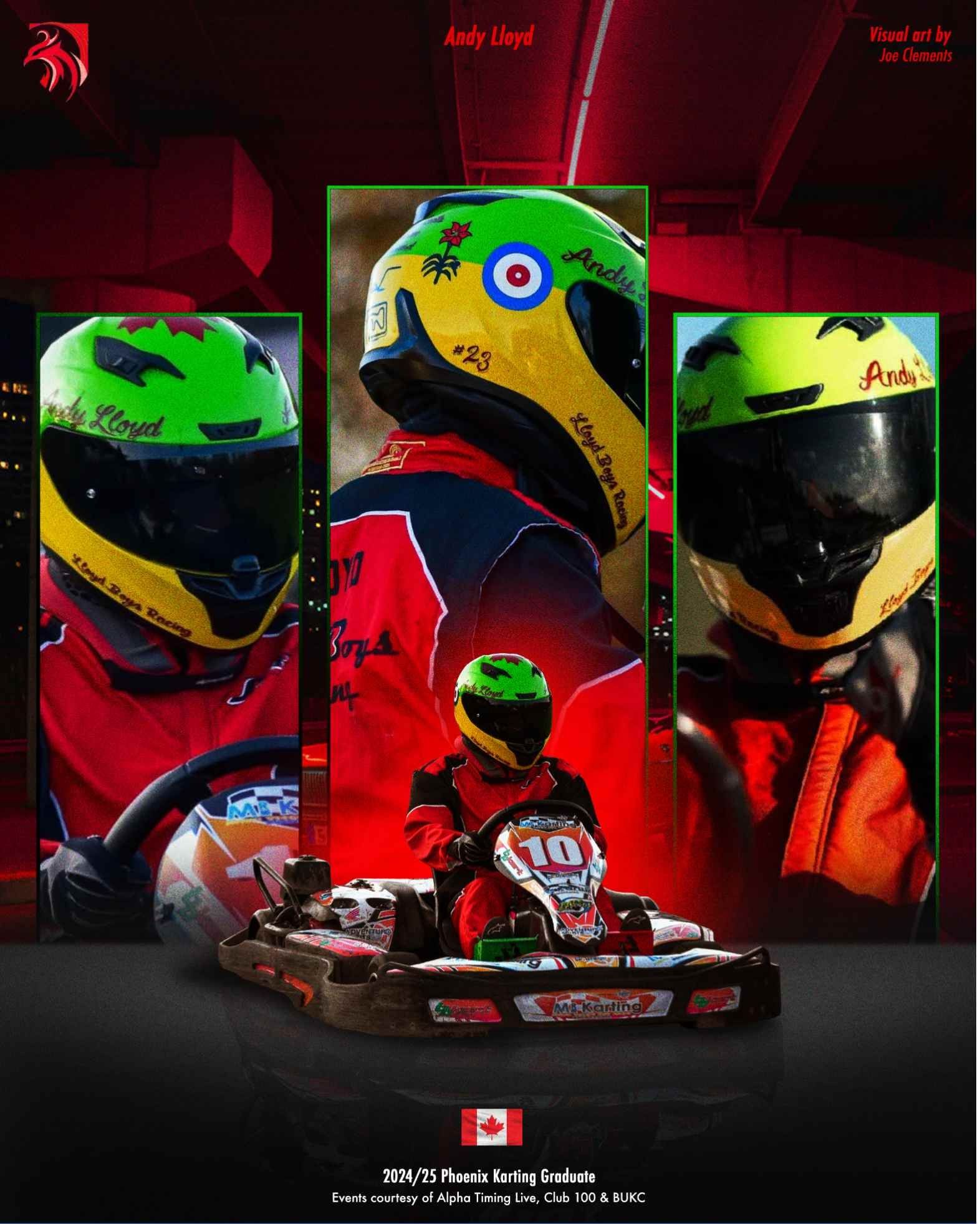
This poster was built around depth and a dynamic, high-impact composition. I constructed the ground by hand in Photoshop, using layered shapes, gradients and reflections to give the kart a realistic surface to sit on. I took a similar approach to the background, combining abstract shapes and lighting effects into an immersive environment that adds to the atmosphere.
The composition centres on the driver, using several cropped images to build a layered story of both the individual and their presence on track. The repeated portrait frames reinforce identity, while the kart in the middle anchors the design and adds realism and motion.
Colour played a key role. The green tones come straight from the driver's suit, and I carried them through the lighting, overlays and accents to tie everything together. Combining built environments with layered photography let the poster feel stylised and grounded at the same time, more than a simple photo composition.
Andy Lloyd
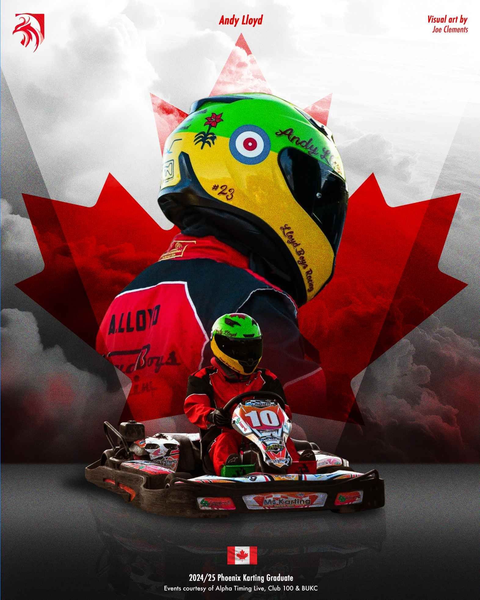
For this alternate poster for driver Andy Lloyd, I adapted the core layout to reflect his Canadian identity while keeping the series consistent. The bold red maple leaf is the central graphic element, grounding the design in national symbolism and picking up the red tones in his race suit, so the poster feels personal without breaking the system.
I also introduced a more textured, atmospheric background, using layered clouds and gradients for depth and intensity. The structure stays the same, with the large portrait at the top and the kart in the foreground, but the colour treatment and overlays give this version a more dramatic, cinematic feel. That balance between consistency and customisation was key to making each driver feel individually celebrated within one collection.
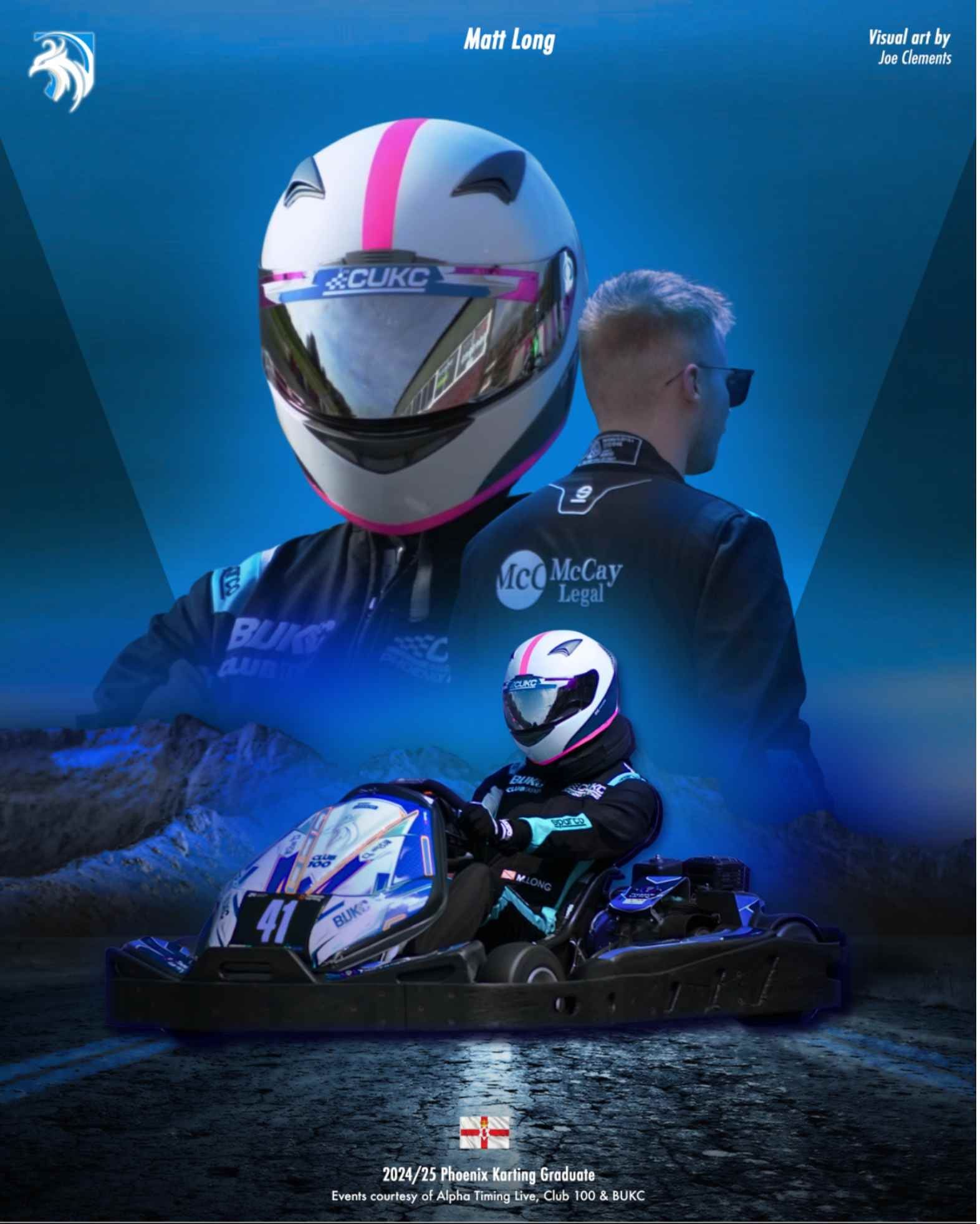
Matt Long, incoming captain
This alternate poster for Matt Long took a slightly different approach, reflecting his role as the incoming captain rather than a graduating driver. The core layout stays consistent with the rest of the series, but a more forward-facing, confident composition positions him as a leader within the team.
The colours come from his suit, with sharper contrasts and a more refined background to set it apart from the graduate posters. It signals progression and continuity within the team as it moves into the next season. Keeping the design language aligned while subtly lifting the tone, the poster celebrates both the individual and the club moving forward.
How it landed
The final designs were well received on social media, with strong engagement and positive feedback from the drivers and the wider karting community. The personal approach helped each poster resonate with its audience, which increased visibility and interaction.
It was also a valuable chance to develop my poster design further, particularly composition, digital construction and building a cohesive visual system across a series.